
UI/UX Design That Fixes
Why People Leave, Not Just
How the Screen Looks
Most websites and apps that underperform aren't badly built — they're badly arranged.... Read More The information is all there, in an order that made sense to the people who own the business and to nobody arriving for the first time.
Where Exactly Do People Give Up on Your Site?
Almost nobody knows this about their own product, and it's knowable. Analytics show where sessions end; recordings show what the person was trying to do when they ended. It's almost never the place owners expect — usually it's a form field nobody wants to fill, a step that asks for a decision too early, or a screen where the next action isn't obvious enough to be worth hunting for.

What Happens Next
Research
Analytics, recordings and, where possible, a few real users
Structure
Flows and wireframes agreed before any visual design starts
Interface
Visual design applied to the approved structure
Prototype & handover
A clickable prototype plus developer-ready specs
Interfaces We've Designed
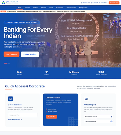
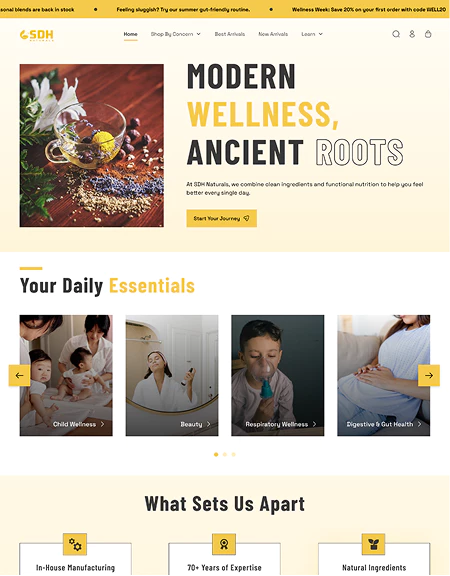
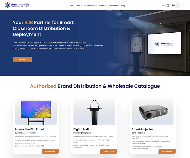
Booking flows, dashboards, admission forms, product pages and internal tools — designed for businesses in Amritsar and Punjab and for clients further across India. Several were redesigns where the underlying product was fine and the arrangement was doing the damage.

Choose the Depth Your Product Needs
Usability Audit
For an existing site or app that isn't converting.
- Heuristic review of key journeys
- Analytics and session recording analysis
- Prioritised list of issues with specific recommendations
UX & UI Design
For a product being built or rebuilt.
- User flows and wireframes for every key screen
- Full visual design with a clickable prototype
- Mobile and desktop layouts, all interaction states designed
- Developer handover with specs and assets
Design System
For products that keep growing.
- Reusable component library with usage rules
- Type scale, colour system and spacing tokens defined
- Documentation so future screens stay consistent
What's Included in Every UI/UX Project
User Flows
Every path mapped before a screen is drawn.
Wireframes
Structure agreed while it's still cheap to change.
Clickable Prototype
Something you can actually click through before it's built.
Accessibility Basics
Readable contrast, real tap targets, keyboard-usable forms.
All States Designed
Empty, loading, error and success, not just the ideal case.
Developer Handover
Specs, assets and spacing values, so nothing gets improvised.
Different Products Have Different Failure Points
E-Commerce
Where the Path From Product Page to Paid Actually Breaks.
Booking & Appointments
Getting From Intent to Confirmed in as Few Steps as Possible.
Dashboards & Tools
Dense Information People Can Read at a Glance.
Mobile Apps
Small Screens, One Hand, Interrupted Attention.
What Works Alongside UI/UX?
Web Development
Building the site the designs describe.
View ServiceCustomized Web Apps
Where good UX matters most, because staff use it daily.
View ServiceMobile App Development
App interfaces live or die on this.
View ServiceE-Commerce Development
Checkout is a UX problem before it's a code problem.
View ServiceWe Design Interfaces People Can Actually Finish a Task In.
Have Questions? We've Got Answers.
Anything not covered here? Just reach out — we'd rather answer a quick question than have you second-guess it.